Fashion’s new love of colour chimes with a renewed interest in colour analysis, says Penny McCormick …
Colour analysis is having a moment. On TikTok, videos tagged #colouranalysis have generated more than 631 million views. There’s even a filter that projects users’ faces against different coloured backdrops, so they can assess which hues are most complementary. In South Korea, personal colour specialists are proliferating in fashion stores and boutiques. And Irish colour analysts, such as Isabel Gleeson, of Styled By Isabel, have noted an increase in enquiries about colour consultations from prospective clients. “The TikTok generation are generally more sustainable and want to shop smarter than previous generations so knowing their very best colours can reduce over-consumption.”
For those who remember Carole Jackson’s 1973 book Color Me Beautiful, which assessed people into seasons based on the tone of their hair, skin and eyes, (I’m a lapsed Cool Winter) colour analysis has moved on. Now, it’s more nuanced and holistic, and no longer works within the confines of a seasonal system.
Many colour analysts create bespoke palettes for their clients. Rather than telling someone they can’t wear a certain colour, it’s a matter of finding a variation of a shade that works best with their features. “Generally, I don’t believe in fashion rules”, says Terri Cooper, of The Style Coop, “and this applies to colour too, with one exception – when combining colours, be creative but wear the most flattering colour next to your face.”
Ginger Burr, a Boston-based image consultant, goes further. She believes that four colours work for almost everyone – forest green, deep teal, watermelon and periwinkle (she admits yellow is really hard to wear).
If millennials are driving the renewed interest in colour analysis, older women are also keen to ditch conservative corporate wardrobes in favour of more flattering colours. As Ruth Murphy, of Positive Image, points out: “Our colouring can change as we age, if we dye our hair a different colour, as we go through menopause and also if we have been seriously ill. If you haven’t yet had your colours done and you notice you need to wear fake tan or full make-up in order to pull off a particular colour, then it is probably not a great colour for you. The right colours should make you feel and look healthier, and rejuvenated.”
Even the most “together” women need help when it comes to colour. Former financier, author, activist and businesswoman Dame Helena Morrissey took to Instagram to tell her followers how a session with image consultant Annie Castaño had transformed her from drab to dressy (@justanniecastano) . She’s swapped black for burgundy, and altered many of her clothes (lengthening mini skirts with a block border of colour) to embrace her style personality. Castaño’s analysis is based on a combination of colour theory (and the classic colour wheel) and colour psychology (how colour impacts emotions and conveys feelings). She labels her clients with style personalities – Morrissey is a Classic Princess; others are Bohemians, Divas, Gypsies or Pirates, etc. She relies on a couple of key lipsticks (Nars Free Bird, a pinky coral, and Casablanca, an orangey red), believes in the power of a flamboyant scarf and reiterates that the more flattering the colours worn, the less make-up is needed. Her overriding message: “It takes people about five seconds to make up their minds about us and it has nothing to do with what we say, but how we present.”
Having your colours analysed may give you the confidence to add pep to your spring wardrobe.
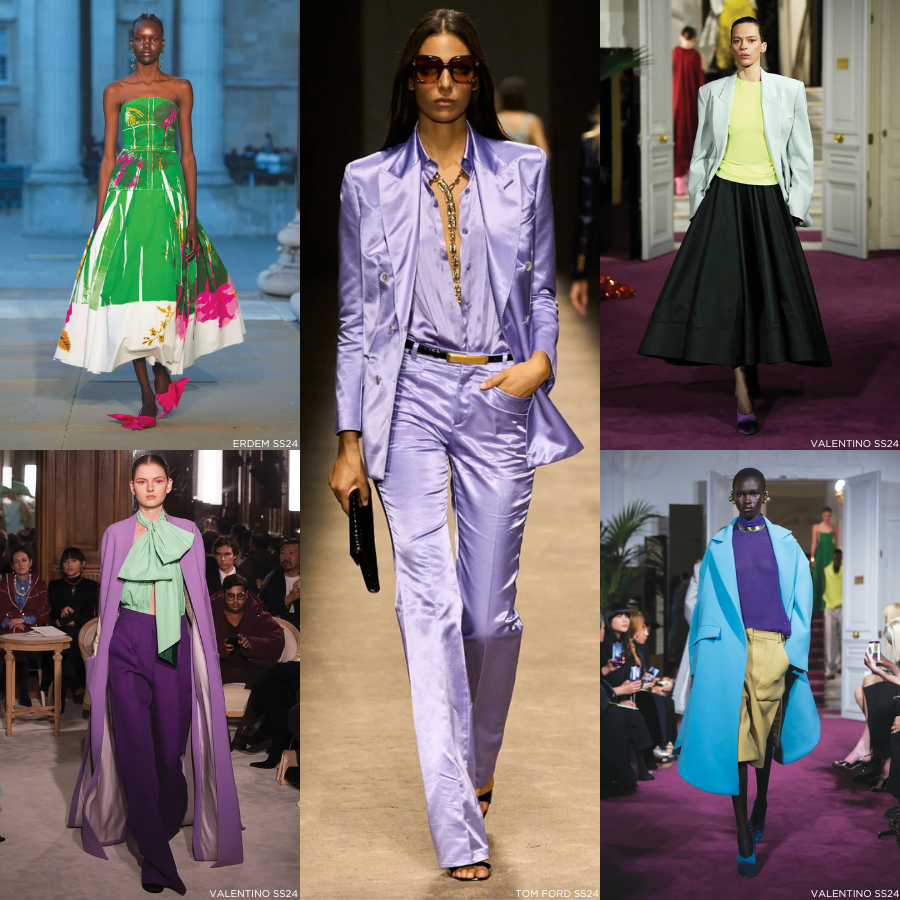
Having your colours analysed may give you the confidence to add pep to your spring wardrobe. At Pierpaolo Piccoli’s Valentino couture show, the designer clashed purple with pistachio, lime with bright blue, scarlet with orange, turquoise with purple. How do we incorporate these bold tones?
Aoife Dunican who has a styling consultancy called The Style Bob, believes wearing colour is an untapped and valuable form of communication. She wears red in order to stand out on webinars, or blues and greens when meeting clients for the first time, as they are the colours of trust and communication.
“Start small: you don’t need to go over the top if you are not used to wearing colour,” she says. “I work with a client’s personality and would never put an introvert into lots of colour as they would feel uncomfortable”.
Integral to combining colours is a knowledge of the colour wheel, believes Cooper. “Colours opposite each other work really well together – yellow and blue, red and green, as do those adjacent to each other. Mixing warm and cool colours can be interesting, as Pierpaolo Piccioli did at Valentino, pairing warm burnt orange with cool grey, and cool pink with warm lime. If you have a warm skin tone, keep the warmer colour next to your face.”
“I’ve had clients who put a blanket ban on a colour, when really it is all about discovering the right tone to suit their colouring,” says Murphy, who encourages experimentation with unusual colour combinations via accessories, detachable collars and bags, and low-cost purchases such as a T-shirt or scarf. For maximum impact, wear one colour head to toe, or two tones of the one colour, per the late Iris Apfel. In her book Colorful she said, “I don’t want you to dress like me or think like me. I want you to find the colours, confidence, and creative inspiration that reflect you. Be brave.”
For more information on the Irish colour consultants mentioned, see here.

